Fun

Where I started: brand and packaging.

Where I started: brand and packaging.

Before product design I spent years on identity, packaging and art direction. Two projects I still point to.

PIMS × Happy End · identity and packaging

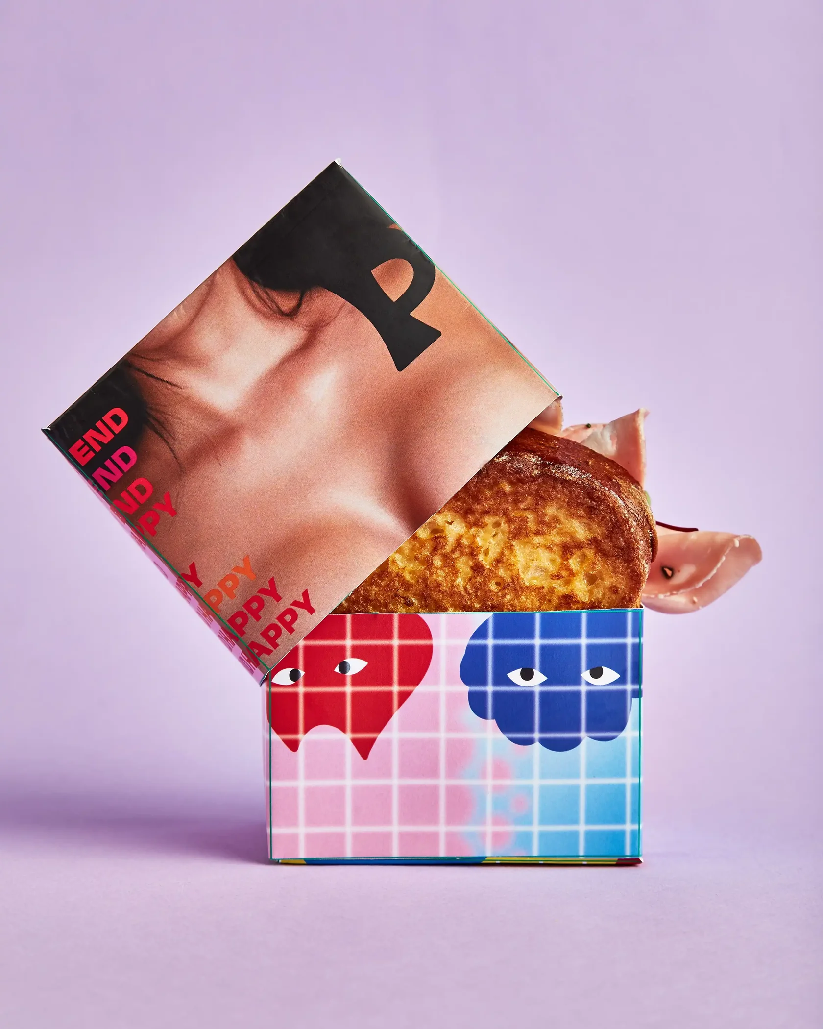
The sandwich box

The sandwich box

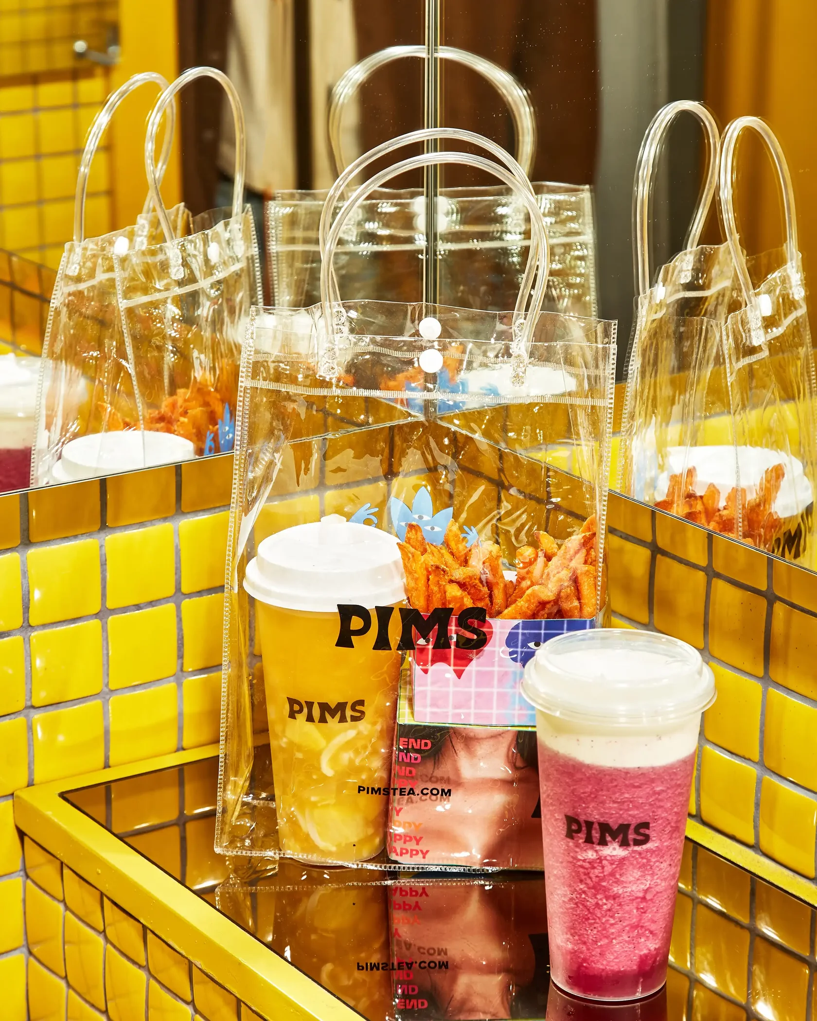
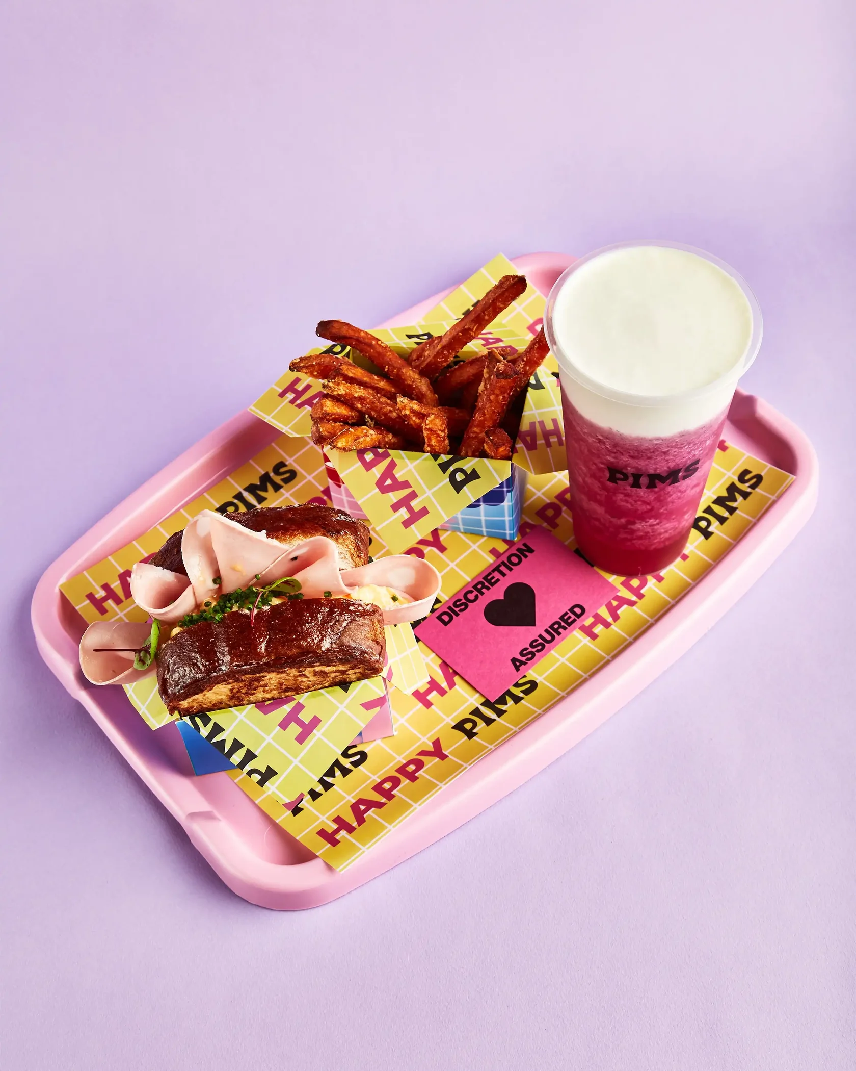
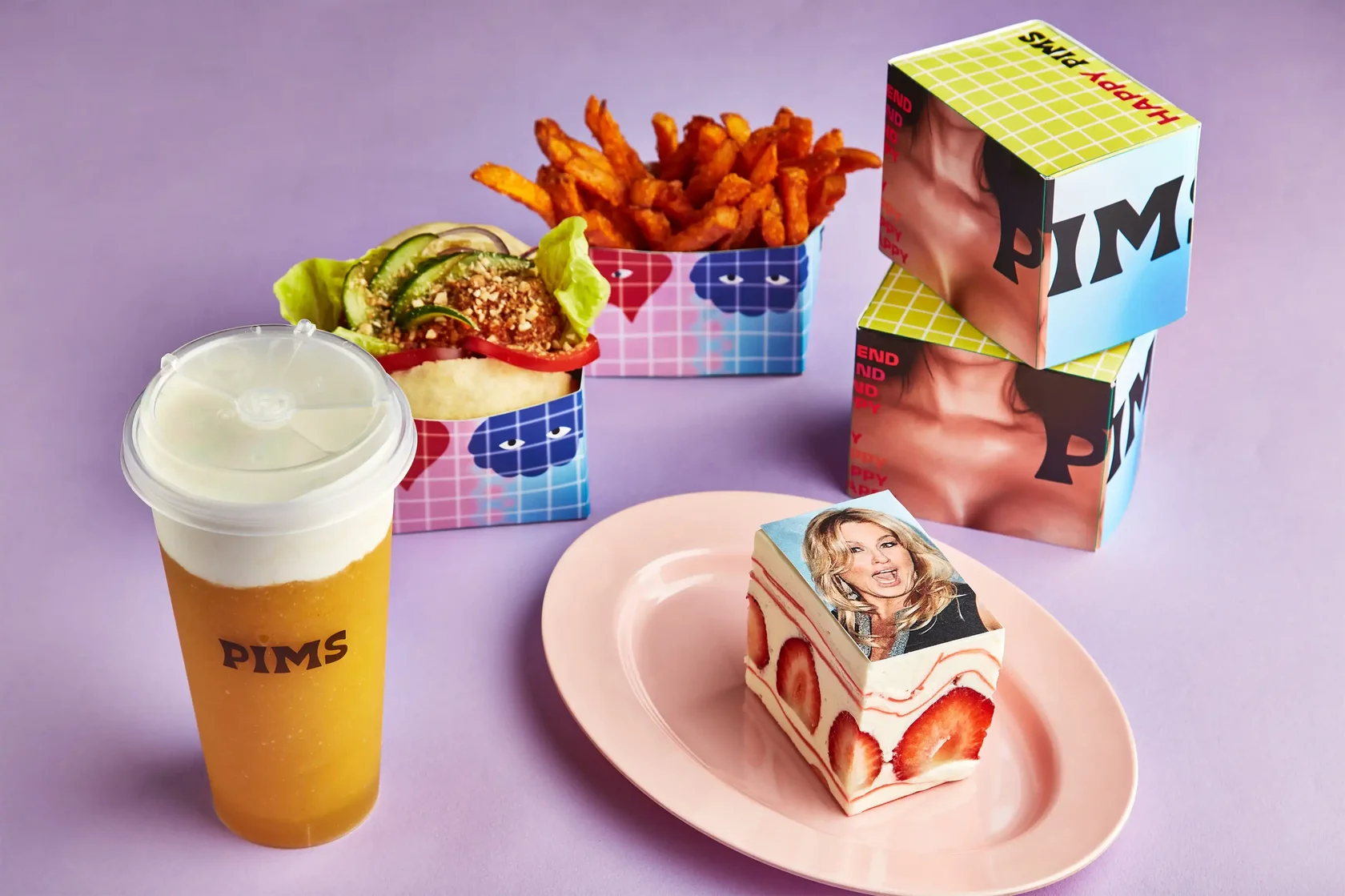
A café and a bar with a deliberately suggestive name, one visual language, and a packaging piece designed to be photographed.
Role

Identity and packaging design

Deliverables

Hero motif, pattern system, dine-in and delivery packaging, print-ready dielines

Constraint

Provocative enough to be honest, safe enough for press and a delivery bag

A wink, not an elbow

PIMS is a playful café; Happy End is a bar whose name is a joke it fully commits to. The collab needed one visual language that amplified both, without either brand disappearing and without becoming something a local publication would decline to photograph.

The hero piece

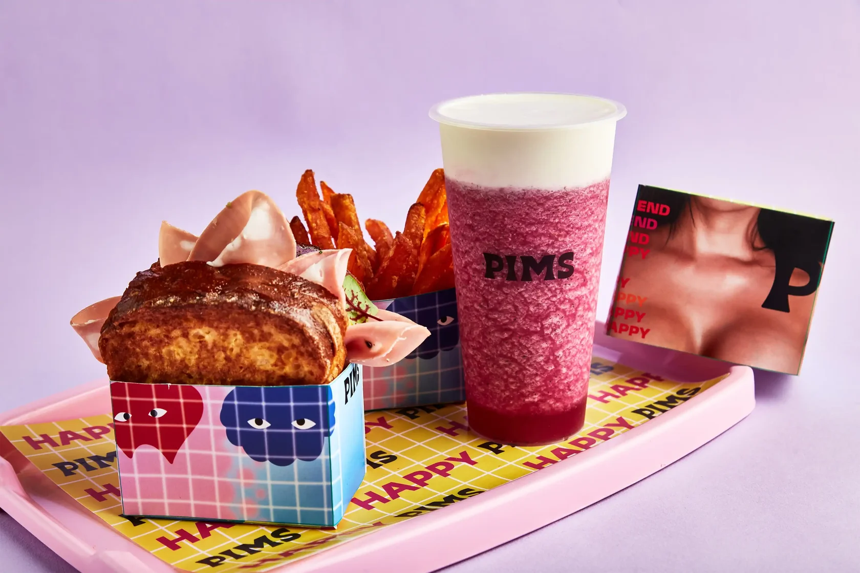
The sandwich box works in two parts: the top carries a cropped image, the bottom completes it with PIMS mascots inverted. Neither half is provocative alone; assembled, the joke lands. It became the most photographed item of the collab.

The unglamorous half

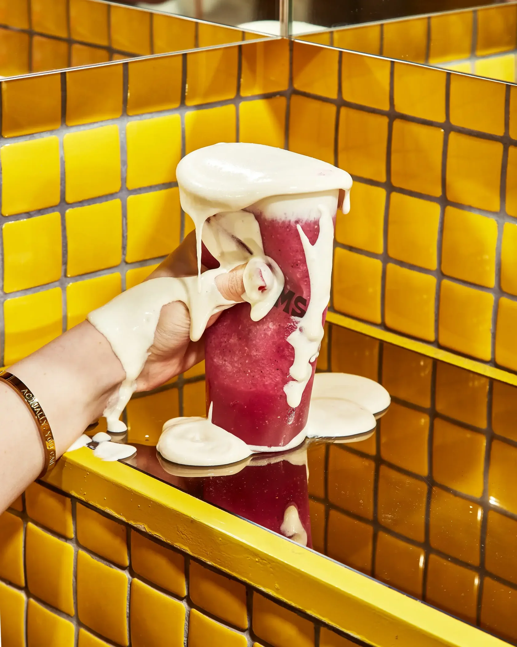
Colour separations worked through with the printers, selective UV on hero elements against matte stock, and vendor-ready dielines. It survived wet delivery bags, and the rollout had no production surprises.

Local press wrote about the design, customers posted it themselves, and nobody had to be asked to photograph it.
Chiquitita · brand identity and brandbook

Grown-ups eat dessert too

Grown-ups eat dessert too

A dessert brand positioned in the gap between cartoon-cute and clinically healthy.

Role

Brand design, from positioning to brandbook

Deliverables

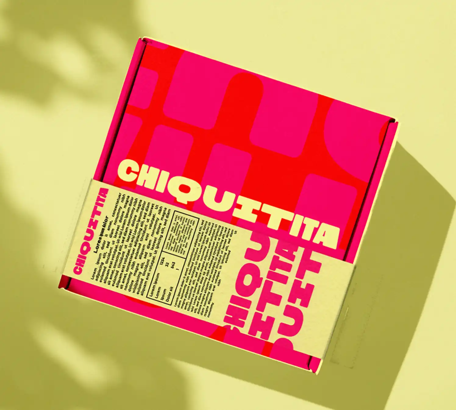
Identity, tone of voice, packaging and dielines, photo direction, brandbook

Built for

Retail, ecommerce and seasonal collabs

The gap in the category

Dessert brands are either childish, with mascots and bubble type, or clinical, with gram counts on the front panel. Neither serves an adult who simply wants something nice. Chiquitita was built for that person: joyful, grown-up and pleased about it.

The system

Electric rose and lemon sorbet held in place by neutral supports, type with enough character to have a personality and enough legibility for a small side panel, a triangular prism pack, and photography with one object and clean light.

The brandbook over the logo

A brand that lives across retail, ecommerce and collabs is handled by people who were not in the room. So the real deliverable was a toolkit that prevents drift: tone of voice with examples, do and don’t, dielines and photo recipes.