
01
The mismatch
TEKO sold itself as the whole business in one place: CRM, inventory, bookings, payments, POS and a no-code website builder.
The fastest growing segment, beauty and HoReCa at around 14% of new users, did not work at a desk. A salon owner works standing up; a café manager checks bookings between orders. The product assumed a mouse and ten uninterrupted minutes.
02
Going to the shops
I ran sessions in real cafés and salons, with real noise and real customers waiting. Two things showed up that never appear in a lab: people use one hand, and every task gets interrupted halfway. The job was not “make it responsive”, it was “make it survivable in twenty-second chunks”.
03
What we changed
Priority over parity
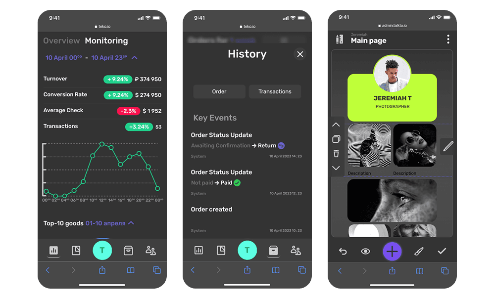
We did not shrink the desktop product. The tasks that happen on the go, like availability, bookings, payments and a quick listing fix, became one-thumb actions. Everything else stayed a desktop job.
Components rebuilt, not reflowed
Collapsible lists, one-tap actions, bottom navigation and generous targets, light enough for the cheap Android devices this segment carries.
Shared foundations
Mobile-first guidelines and shared tokens across modules, so each product team stopped solving the same problem separately.
04
The website builder
TalkTo, the built-in builder, already knew the business but behaved like a design tool: panels, toggles and a blank canvas. For a salon owner with no design background, that is not a feature set, it is an exam.
Outcome first
Not “build a website” but “what should it do”: a menu, a booking page, services and prices, filled from the platform’s own data.
Templates by vertical
Beauty starts at services and prices, a café at menu and table booking. Nobody starts from nothing.
No jargon
Hero image became main photo, CTA became main button. With autosave, undo and version restore, a first site went live in under twenty minutes, from a phone.

05
Results
Churn fell 11%, tracked with Amplitude, Hotjar and weekly A/B tests. Offline payment speed rose 30%, measured from pressing pay to the money leaving the card. Booking and CRM reached break-even in 90 days, and support stopped getting questions that begin with “how do I connect”.
06
What stayed
The durable outcome was a rule, not a release: every new feature had to work on a phone as well as a desktop, from the start.
